 User Interface Design for Programmers
Joel Spolsky
150 pages
Apress, 2001
$29.95
ISBN: 1-893115-94-1
www.apress.com
User Interface Design for Programmers is an introduction to the key principles of user interface design. It is short enough that you can get through it in one evening; it is well enough written that doing so is a pleasure rather than a chore; it is comprehensive enough to cover the fundamentals.
Why do programmers need to know anything about user interface design? The borderline between designers and programmers is hazy at best. Every day “mere” programmers make any number of design decisions that directly affect usability, so a nodding acquaintance with the key principles is essential to provide some direction. And even if you’re working on something far removed from end users, someone will use the fruits of your work, and usability principles apply as much to API design and error handling paradigms as they do to dialog design.
User Interface Design for Programmers is strictly about interaction design. Only in connection with affordances does Joel briefly discuss looks rather than behavior, and even then he expounds on the principle of the thing rather than the aesthetics. Fair warning: This book won’t teach you anything about typography or graphic design.
The cardinal axiom of user interface design goes like this:
“A user interface is well-designed when the program model conforms to the user model.”
That’s not all there is to it, of course, but this must always be your starting point. If the user’s mental idea of what the program does is wrong, usability goes down the drain. Joel uses the program models of Word and FrontPage to exemplify this: If you insert an image into a Word document, the image gets embedded in the document. You can safely delete the original image file; the Word file still contains a copy. Inserting an image into a FrontPage document is a different story: The underlying storage format is HTML, which stores a reference to the image file rather than an embedded copy. If you delete the original image file, you’re in for a big surprise if you’re used to Word’s program model.
Decision-making is a vital part of any design process. It is difficult, though; if you include one design idea you may have to exclude another. Too often, the designer shies away from the decision and leaves it up to the user instead: If you call it an option, you can pretend it’s a feature.
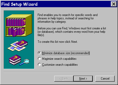
Many “options” are bugs rather than features. True, users relish having a choice wherever they actually care about the outcome, but in many cases they don’t. Joel uses this dialog as a case in point:

Roughly 99.67% of users want help; they don’t want to get sidetracked into making meaningless decisions they’re unqualified to make in any case. I have personally encountered that dialog box 748 times by the last count, and every single time my response has been to hit the Return key. What do I care? Give me help, not meaningless choices!
The Joel Uncertainty Principle holds that “you can never accurately measure the usability of a software product.” Joel believes that the most important purpose of real-life usability testing is to find glaring problems as early as possible, and that the second most important purpose is educational: Let your designers and programmers watch as users struggle; there is no better eye-opener to be had.
Too often, usability tests measure learnability rather than usability. There’s nothing wrong with measuring learnability, but you will quickly be led far astray if you do this believing it’s usability you’re measuring.
Throughout the book, Joel uses anecdotes and examples to illustrate his points. Many of the examples are from work he’s been directly involved with, and this lets him discuss not only why something is wrong, but how it came to be that way. He does not provide detailed rules and checklists; instead, he provides guiding principles:
- Controlling your environment makes you happy.
- Users don’t read the manual. In fact, users don’t read anything. (This is not really true, of course, but if you behave as if it were true your programs will be easier to use.)
- Design for extremes. A program that is usable by the stupid, the handicapped or the preoccupied is easier to use for everyone.
In addition to being useful, user interface design is also fun. Clearly Joel thinks so, and he puts across his enthusiasm wonderfully. His writing style is relaxed, informal, and humorous. Once or twice he gets too cute for my bourgeois taste, but for the most part, his style is spot on.
User Interface Design for Programmers is in full color, richly illustrated and highly recommended. It is also available online at http://www.joelonsoftware.com/.
(Start bottom menu)
Top •
Home
• Articles
• Book
• Resources
Windows Developer Magazine
• R&D Books
• CMP Books
Amazon.com
• Amazon.co.uk
• Contact Petter Hesselberg
(End bottom menu)
